Трансформирайте финансовите си данни в красиви визуализации
С радост обявяваме значително подобрение в екосистемата на Beancount.io: официалната интеграция на beancount-dashboard. Тази мощна нова функция предоставя набор от богати, интерактивни визуализации директно във Fava, позволявайки ви да видите финансовата си история ясно, убедително и практично.
Какво е beancount-dashboard?
beancount-dashboard е отворен плъгин за Fava, уеб интерфейса за Beancount. Той трансформира вашите финансови данни в чист текст в динамични и проницателни табла, правейки разбирането на финансовото ви състояние и вземането на информирани решения по‑лесно от всякога.
Плъгинът предоставя широк набор от мощни визуализации:
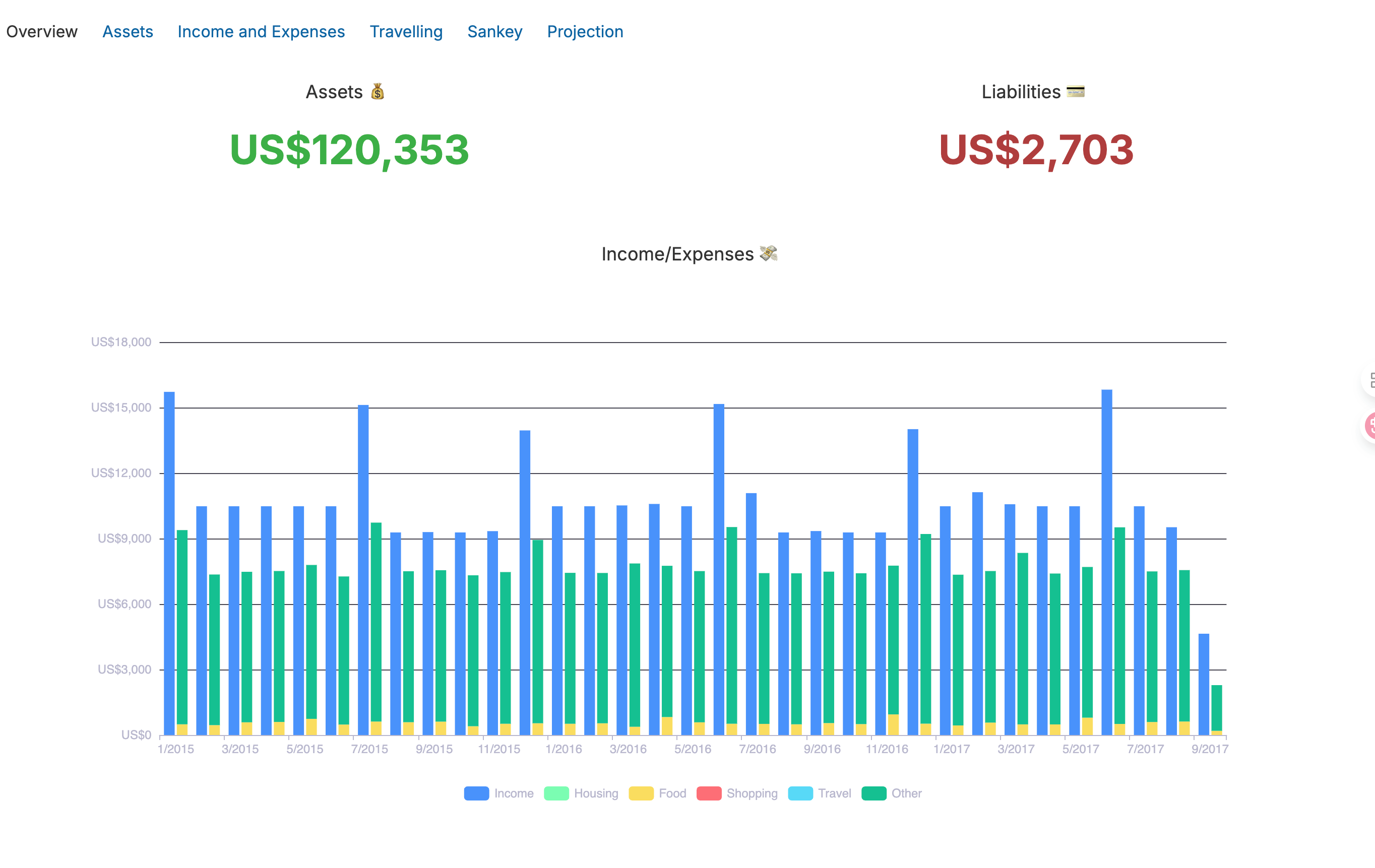
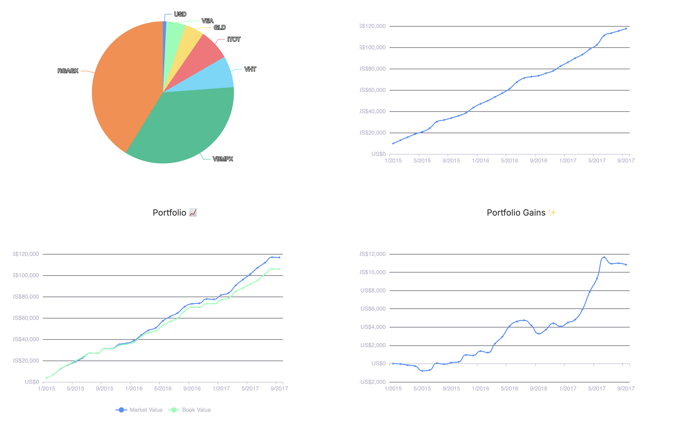
- 📊 Всеобхватни изгледи на активите: Следете богатството си с Диаграма на нетната стойност, наблюдавайте представянето с подробен Проследяване на портфейла, и визуализирайте разпределението си с пай диаграми за Разпределение на активите.
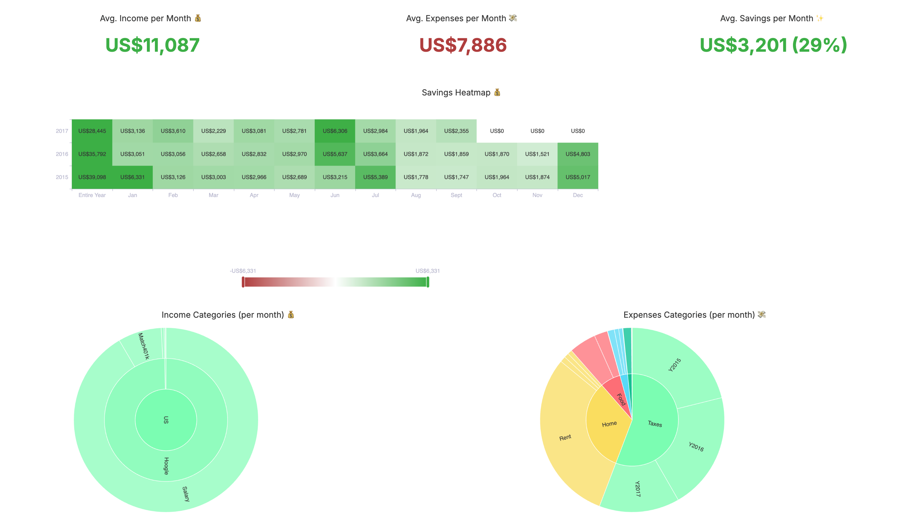
- 💰 Анализ на приходи и разходи: Разберете паричния си поток с точност. Анализирайте Месечни средни стойности, разгледайте разходите по Категория, и вижте как навиците ви се променят с Годишен анализ.
- ✈️ Управление на разходите за пътуване: Следете годишните разходи за пътуване и анализирайте моделите на разходите по дестинация, за да бюджетирате по‑ефективно за бъдещи пътувания.
- 🔄 Сангей диаграми: Визуализирайте потока на парите си с интерактивни диаграми, които показват как средствата се преместват между източници на приходи, сметки и категории разходи.
- 📈 Финансови прогнози: Планирайте бъдещето, като използвате историческите си данни за задаване на цели и проектиране на финансовата ви траектория.
Защо интегрирахме beancount-dashboard
Тази интеграция променя играта за общността на Beancount, предлагайки четири ключови предимства:
1. Подобрено потребителско изживяване
Beancount е построен върху стабилна основа на двойно записване, но суровите данни могат да бъдат претрупващи. Плъгинът beancount-dashboard превръща сложните главни книги в интуитивни визуализации, прав�ейки финансовото управление достъпно и ангажиращо за всеки.
2. По‑добро финансово вземане на решения
Визуалните табла ви дават възможност да правите по‑умни финансови избори. Те ви помагат да идентифицирате тенденции, оптимизирате бюджети, проследявате цели и планирате напред с увереност, като представят данните ви в лесно смилаем формат.
3. Професионален анализ
Тази интеграция ви предоставя аналитична мощ от корпоративно ниво под пръстите ви. Захранвани от Apache ECharts, таблата предлагат интерактивни графики, персонализирани изгледи и актуализации в реално време, които отразяват последните ви транзакции. Отзивчивият дизайн осигурява безпроблемно изживяване на всяко устройство.
4. Отличие в отворения код
И Beancount, и beancount-dashboard са ангажирани с принципите на отворения код. Това означава, че получавате пълна прозрачност относно начина, по който се обработват вашите данни, гаранция за поверителност (тъй като данните ви остават във вашата инфраструктура) и подкрепа от активна и иновативна общност.
Реални предимства
Тази интеграция предоставя незабавни и осезаеми ползи за различни потребители:
За лични финанси:
- Бюджетиране: Вижте точно къде отиват парите ви всеки месец.
- Цели за спестявания: Визуализирайте напредъка си към фонд за спешни случаи, ваканция или пенсия.
- Наблюдение на инвестициите: Следете внимателно представянето на портфейла си и разпределението на активите.
За малки предприятия:
- Управление на паричния поток: Наблюдавайте ликвидността на бизнеса и разберете моделите на паричния поток.
- Анализ на разходите: Анализирайте бизнес разходите по отдел, проект или доставчик.
- Финансово планиране: Използвайте исторически данни за по‑точно бюджетиране и прогнози.
За финансови консултанти:
- Презентации за клиенти: Създавайте професионални, лесно разбираеми финансови отчети.
- Анализ на портфейла: Провеждайте всеобхватно разпределение на активите и проследяване на представянето.
- Съответствие: Поддържайте подробни и достъпни записи за одит и отчитане.
Готови ли сте да трансформирате финансовия си живот?
Пътуването ви към по‑добро финансово управление започва сега. С мощта на beancount-dashboard разполагате с всички инструменти, от които се нуждаете, за да поемете контрол над финансите си.
- Посетете beancount.io
- Създайте безплатен акаунт за достъп до пълната екосистема на Beancount.
- Присъединете се към хиляди потребители вече управляващи финансите си с увереност.
Искаме вашата обратна връзка
Вашите идеи са безценни, докато продължаваме да усъвършенстваме платформата. Помогнете ни да се подобрим, като споделите вашите истории за успех с таблата, заявки за функции и всякакви доклади за грешки, които срещнете. Можете да се свържете с екипа на Beancount.io чрез нашите форумни общности, GitHub Issues или в социалните медии.
Присъединете се към процъфтяваща общност
Свържете се с други потребители на Beancount, за да споделяте конфигурации на таблата, да се учите от експерти и да допринасяте със свои знания. Останете в течение с нови функции и помогнете да оформим бъдещето на финансовото управление.
Тази интеграция представлява значителна стъпка напред, като предоставя корпоративна аналитична мощ, отворен код и безпроблемно потребителско изживяване.
Готови ли сте да революционизирате проследяването на вашите финанси? Регистрирайте се на beancount.io днес, изпитайте силата на beancount-dashboard и ни помогнете да изградим заедно бъдещето на финансовото управление!